


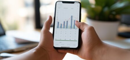

Landing pages follow trends in their design and functionality, as well as analytics trends. For example, mobile optimization became a top criteria when rating a landing page since more and more people access pages from their mobile devices. Once Google acknowledged this and translated it into its parameters, optimizing for mobile went from being optional to mandatory. It went from functionality to analytics, and all web pages owners perceived mobile optimization as an urgent and critical matter.
The design is shaped by less obvious factors – but it can be identified in terms of trends too. In a certain time frame, in their own rhythm, all websites change their landing pages aspect. How does this happen? Is it the client’s request, or the agency’s suggestion? Is it that suddenly our perception identified a certain design as being the “modern” design, the image of efficiency and success, or is it something else? Absolute innovation is not a daily thing – when a new idea finds its perfect outlet, it is followed by a series of replicated design elements. And, one day, that precise structure is the latest, the best, the one that anyone must have.
Functionality is perhaps the most organic out of the two – when navigating on a page, it is only logical that certain elements or features are serving the user’s purpose, while others annoy or rend more difficult its search. The positive or negative reaction is rather common to most of the users, since their devices share many characteristics. On a tiny screen, all users will be accommodated by the same landing page structures and features, and annoyed by others.
The current design – and by current we mean trending – greets the eye with large spaces, big images, continuous scroll and generous blocks of features. You may compare the following landing pages and notice their common traits: Techspot, TNW, Newscreed and Marketo. Top big sliders feature images (or videos), scrolling down we may see lots of unoccupied space and a generous, un-crowded distribution of images and articles – all these seem to be common traits. There are other ways of describing such pages: clean, fluid, customer-friendly.
Looking at other similar lists on the Internet, there was a landing page that appeared in quite a few recommendations:
1. Wistia
Opening straight into the product section, the video sequence underlines what Wistia is all about. Their old page featured a streaming video sequence, which was a bit tiring if one kept the page open for a longer time – the video played on a loop (you may find now the same video at the Product section, paused by default. The current landing page is less tiring, with generous spaces and less default movement. But this is more like a vestibule landing page – whomever is looking for information is expected to go to the Menu section. The Menu on the other side is surprisingly minimalist – the sections open up quite unexpected types of pages – aspect-wise. The signup page is often used as an example of clear, simple page, trying to offer concise information while not tiring the eye.
It is perhaps a matter of taste, but I do not quite understand what exactly makes Wistia’s page stand out in line when it comes to great landing pages. It apparently is a very good example of friction elimination, too. But taking a look at it serves as a reference point – and they do deal with landing page videos.
Moving on, let’s see five different types of landing pages that are please the eyes, the mind and the analytics equally.
Another big-spaced landing page, with bright colors and a soothing overall appearance, Plated has a short but concise headline that makes it clear what the company’s unique value proposition (UVP) is. The design is a conversion one. Each page element offers a micro-service description accompanied by fresh, attractive food images. There are only 3 action buttons on the landing page, out of which two interconnected (the same button twice) – no crowded or confusing elements. Although one might feel the need to click other headlines for more pictures and text details, nevertheless the Plated landing page is given as a positive example by some comparative tops.
We’ve started with a service page – food category. Now another service, this time in the clothing-related. The landing page is again very clean and it inspires a formal but still youngish style, where hard chores are solved easy and in a perfect, classic yet trendy manner. The “Get Started” button is again duplicate, but it blends in pleasantly with the other buttons – maybe a bit too well.
The images illustrate how the service delivery works. There are two CTA buttons – “Get Started” and “Sign Up”. The testimonials are a plus element.
This time we take a look at a mobile app landing page – a product, not a service. Well, a software product. The page is very colorful and dynamic – intense nuances, big sections in different colors across the screen.
The landing page is again, as it was in Wistia’s case, an opportunity for the brand to showcase its product. The unoccupied spaces seem huge, and the buttons are intense. The headline image is static, yet full of energy.
Landing pages for apps are generally different, very visual – featuring bold colors and large icons. It’s all about “right here, right now”, trying to stimulate the urge of using the product immediately. One may call these pages a visual-fest. It is worth noticing however that the Over page downgraded its visual intensity and colors recently and became a more sober, minimalist version of itself.
This time we have chosen landing page for a product, not a service. The pictures depict the fitness wristband in huge, un-cluttered images. The price is upfront, the types of products are clearly presented. You can see similarities with the Plated landing page – it is basically the same page algorithm, with micro-categories that are put in relation with each other. The scroll is rather long as the page features the connected app too, but the CTA buttons have a straightforward message “Shop Style” or “Check the compatibility”, and are visible underneath the product (one for each different kind of tracker). This is the trending type of page structure – aerated, with concise text and easy to spot sections.
This guided view took us through three service-offering landing pages and two product-presentation pages. The common design features are quite obvious, and the functionality main features go without saying: mobile optimization, easy navigation, CTA buttons cleverly placed and standing out from other page elements. The potential customer has a certain questions flow, and the page creators have tried to think ahead when deciding the placement of the page sections.
Compared to previous trends in landing page structuring, one might say that the current aspect and functionality is more minimalist, yet remains lavish. It captures the attention of the viewer and avoids losing the same attention by offering too many unnecessary elements.